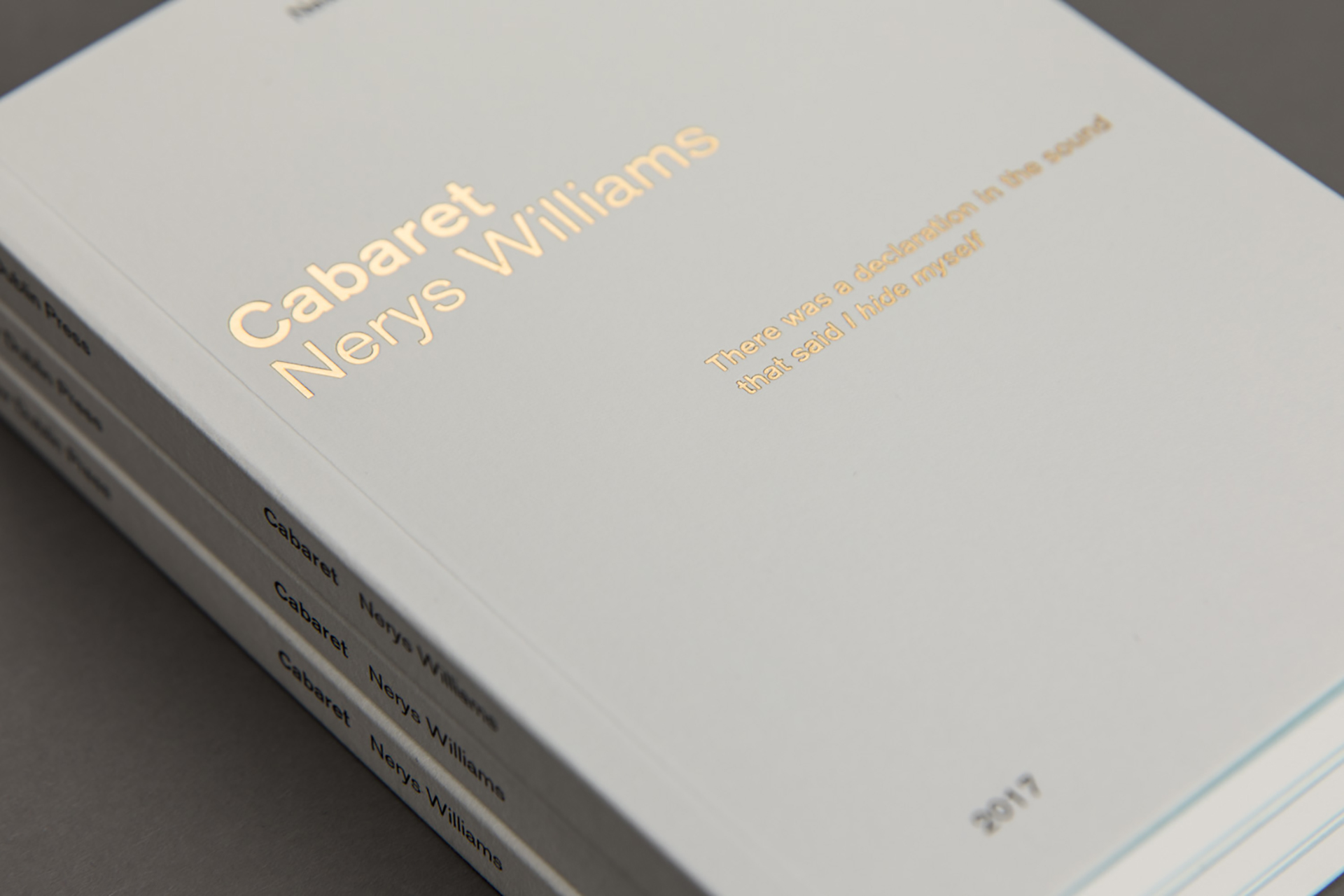
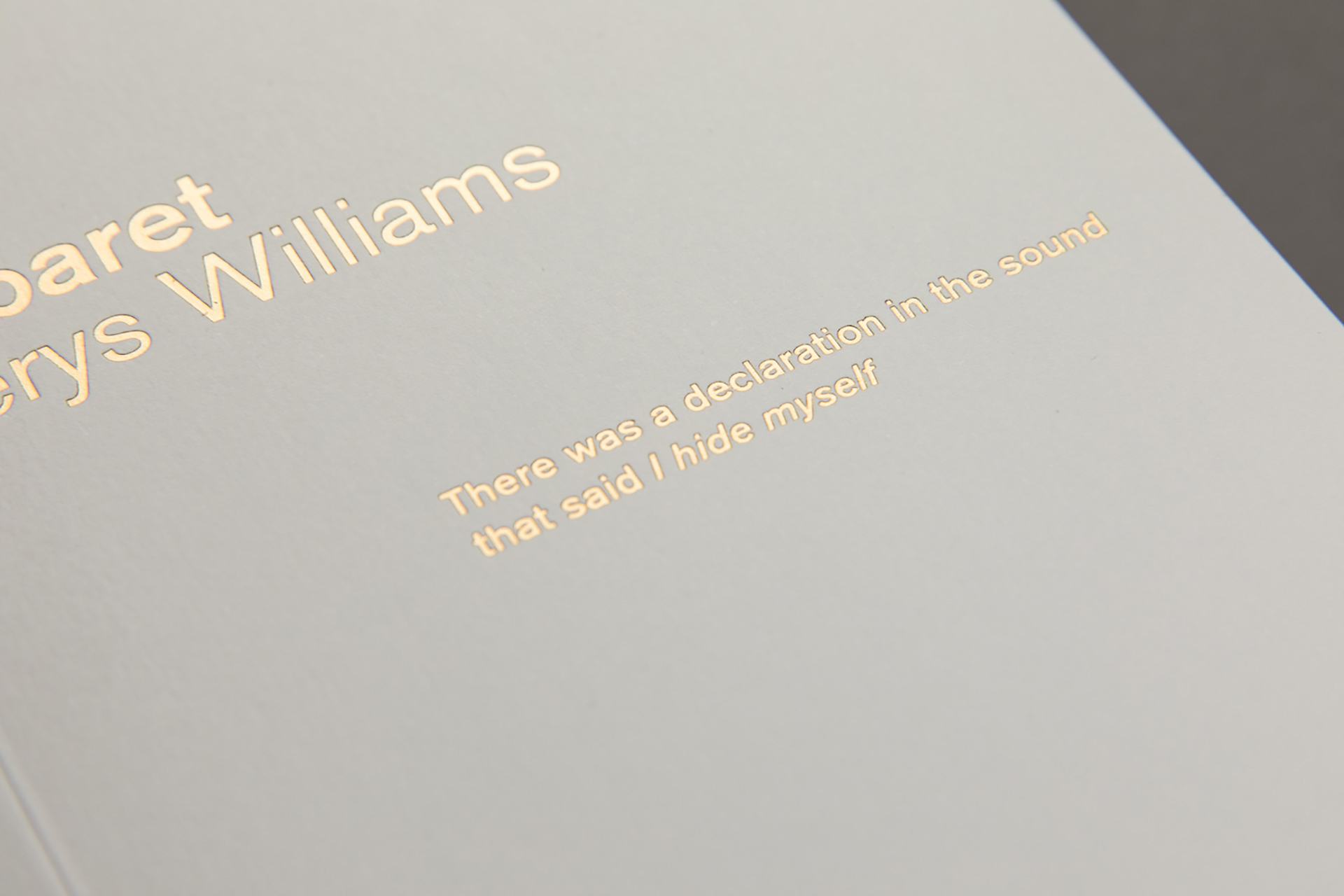
“The brief I brought to the design studio was at once practical and full of meaning. I wanted a pocket-sized format for books of poetry. The first text to be published was Cabaret, by Irish-based Welsh poet Nerys Williams. On the practical side, I wanted a format that was economical and replicable across a series of volumes – Cabaret as No. 1, with nine small books to follow. The task was to lay the foundation, and allow the series to grow with subtle variation. The meaning lies in the intimacy of such a book – one that can be quickly tucked into a pocket on the way out the door.
These are the books that travel with us through the world; the ones we return to again and again; the volumes that trace our movements, punctuating these moments with pieces of literature that change as we change in our relation to them. If large tomes are marks of distinction resting on our shelves, these small books are the ones we actually read, the ones we live with, actively. There is a history of such volumes, from portable religious texts and prayer books to the City Lights Pocket Poets, which gave us Howl and Lunch Poems. I carry two such books with me almost constantly: a small leather-bound collection of Emerson’s essays given to me by my late mother, and a paperback edition of Robert Creeley’s, On Earth, the last book he wrote before his death. Jonathan C. Creasy – Publisher, New Dublin Press The response to the above brief was to create a unique pocket sized format book.
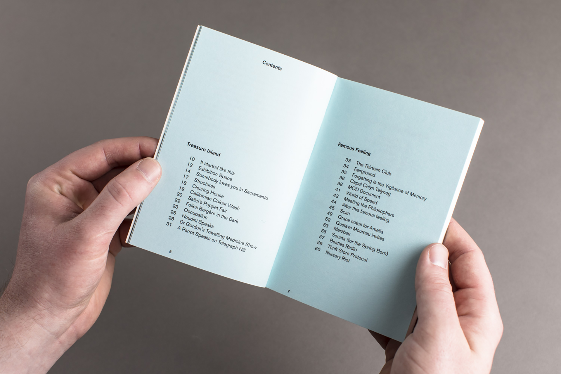
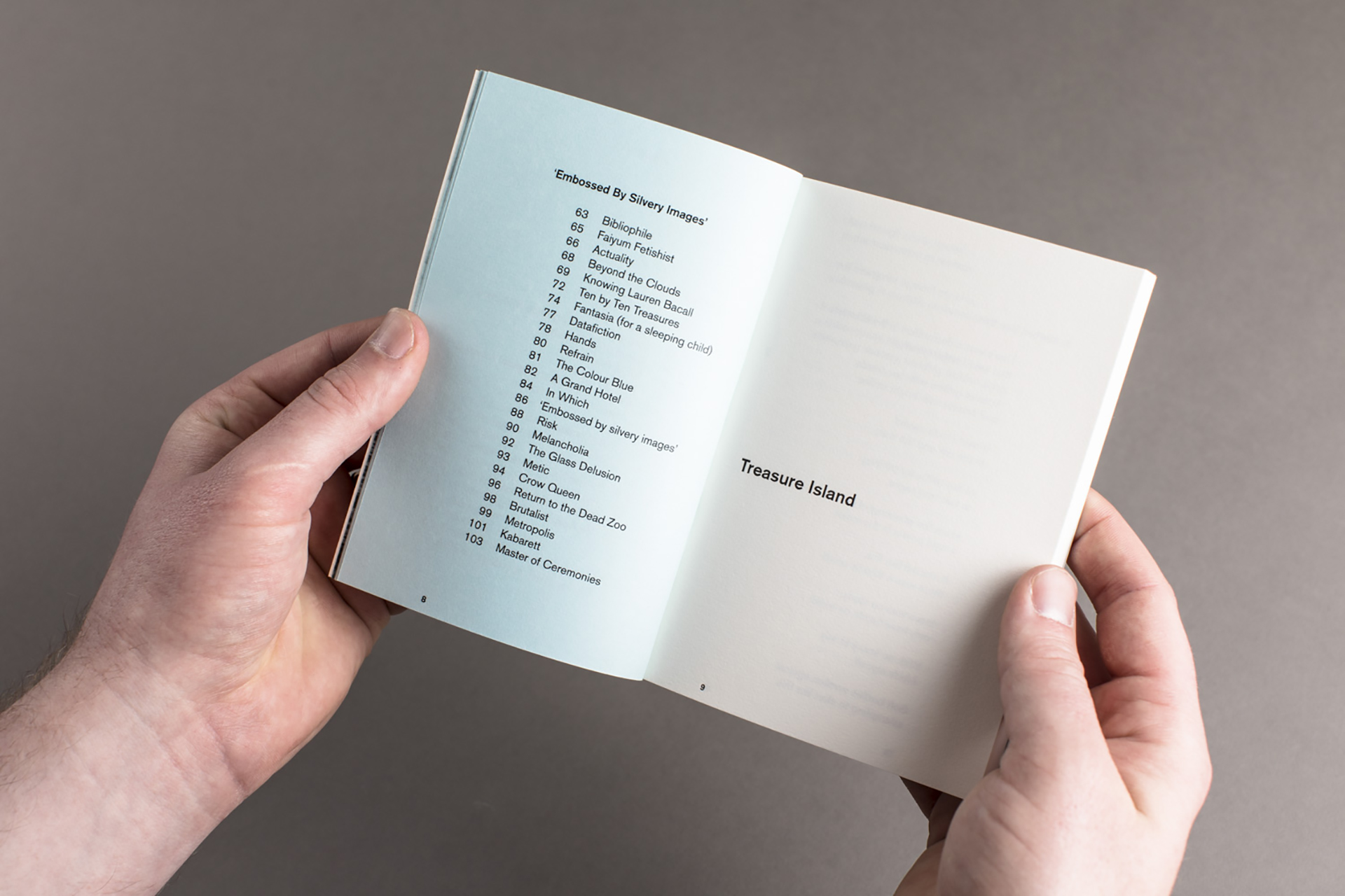
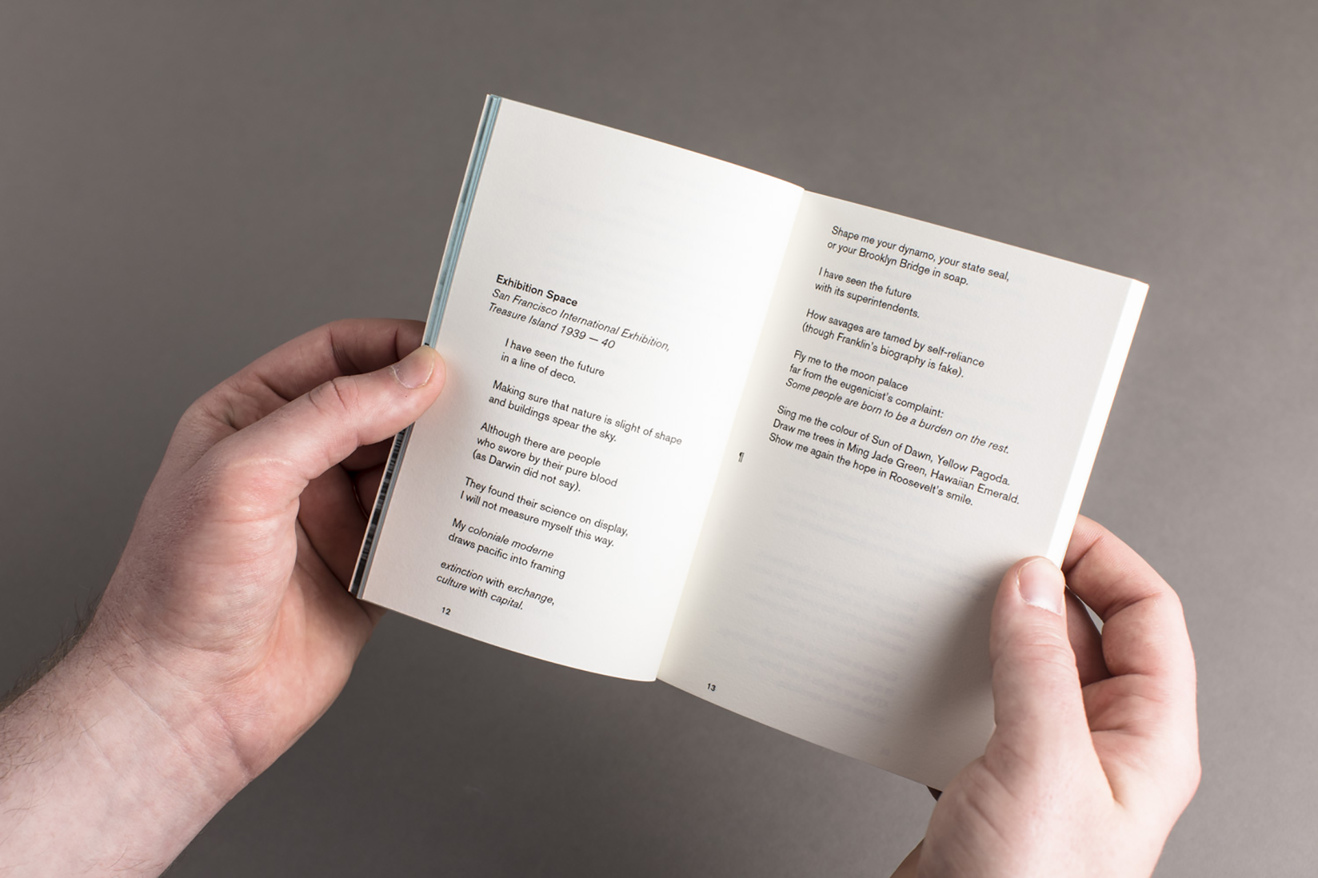
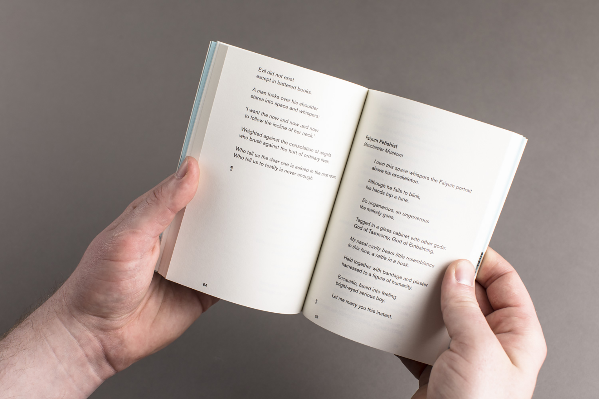
From the outset our design had to have one eye on the future editions that would make up the series. In order to meet the future requirements we designed a robust and flexible grid system and typographic approach, one that could be implemented in myriad of ways depending on both the budget, content and writing style for each individual edition. In the case of Cabaret we had to bear in mind throughout the process that the content we were dealing with, poetry, is written in a highly specific manner. Our challenge was to utilise the our typographic system to display the text as the author had intended it to be read. Stanzas needed to remain intact and could not be split across pages. Our design response was to utilise the grid and typographic systems to allow for each poem to begin at any point on any given page ensuring no stanzas would be split. This gave the whole project a free-flowing feeling and allowed for a more creative approach too the text layout than may be traditionally seen in volumes such as this. The series is designed in such a way that materials and printing methods can be expanded upon where both our budget and number of editions allow. Simplistic choices can be made on each project depending on the content to allow for different types and scales of printing, use of materials and use of finishes. Type layout, Typeface choice, its scale and use is entirely flexible within the system. This will ultimately allow for a coherent set of books that subtly change whilst retaining a holistic overall identity.