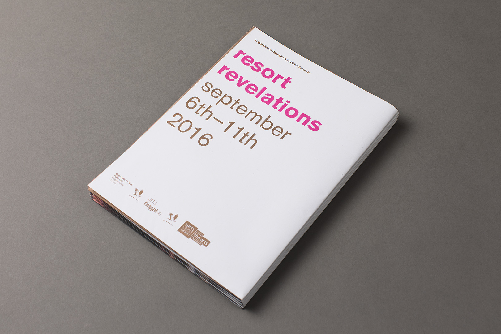
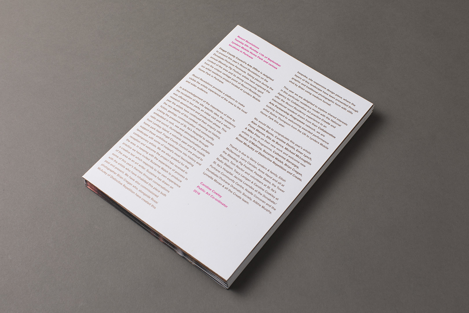
Resort Revelations is the combined output of artists who have completed the Fingal Arts artist residency project located on the Portrane Peninsula. In acknowledgement of the importance of time to the incubation of the site specific idea the residency is offered in two parts: an initial visit and a return research development and production phase.
We were commissioned by Fingal Arts to design a poster to showcase the process of the residencies and its intentions whilst also serving as a schedule for the events surrounding the Resort Revelations showcase. The studio worked with photographer Brian Cregan and writer Suzanne Walsh to create a piece that explored the area of Portrane. Suzanne wrote a new piece of text whilst on residence that would form a significant part of the piece entitled ‘Who will silence them at last’. Embedded in her piece are a series of fragments from the Samuel Beckett short story ‘Fingal’ and quotes from an undelivered letter written by a patient in St.Ita’s hospital in 1912.
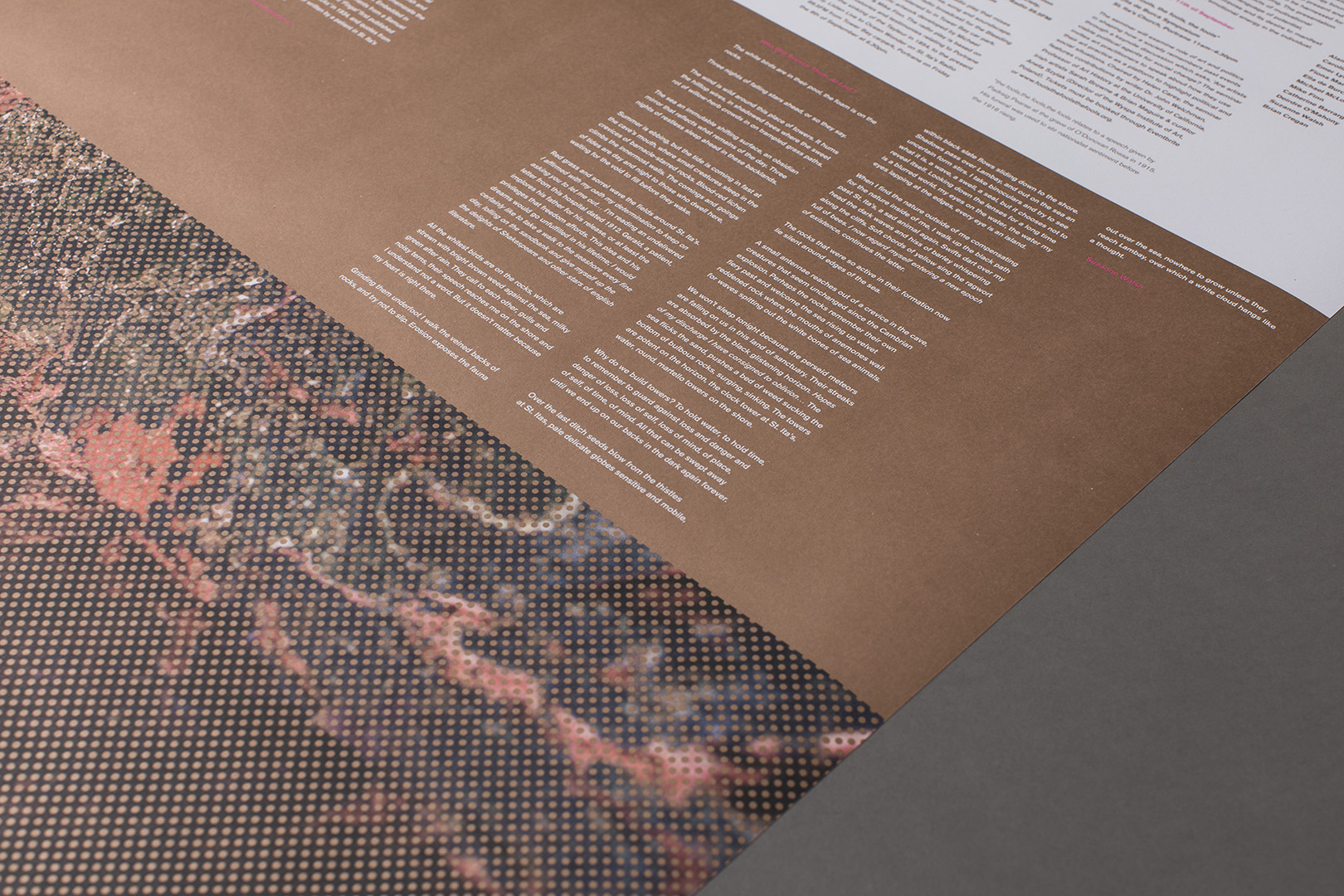
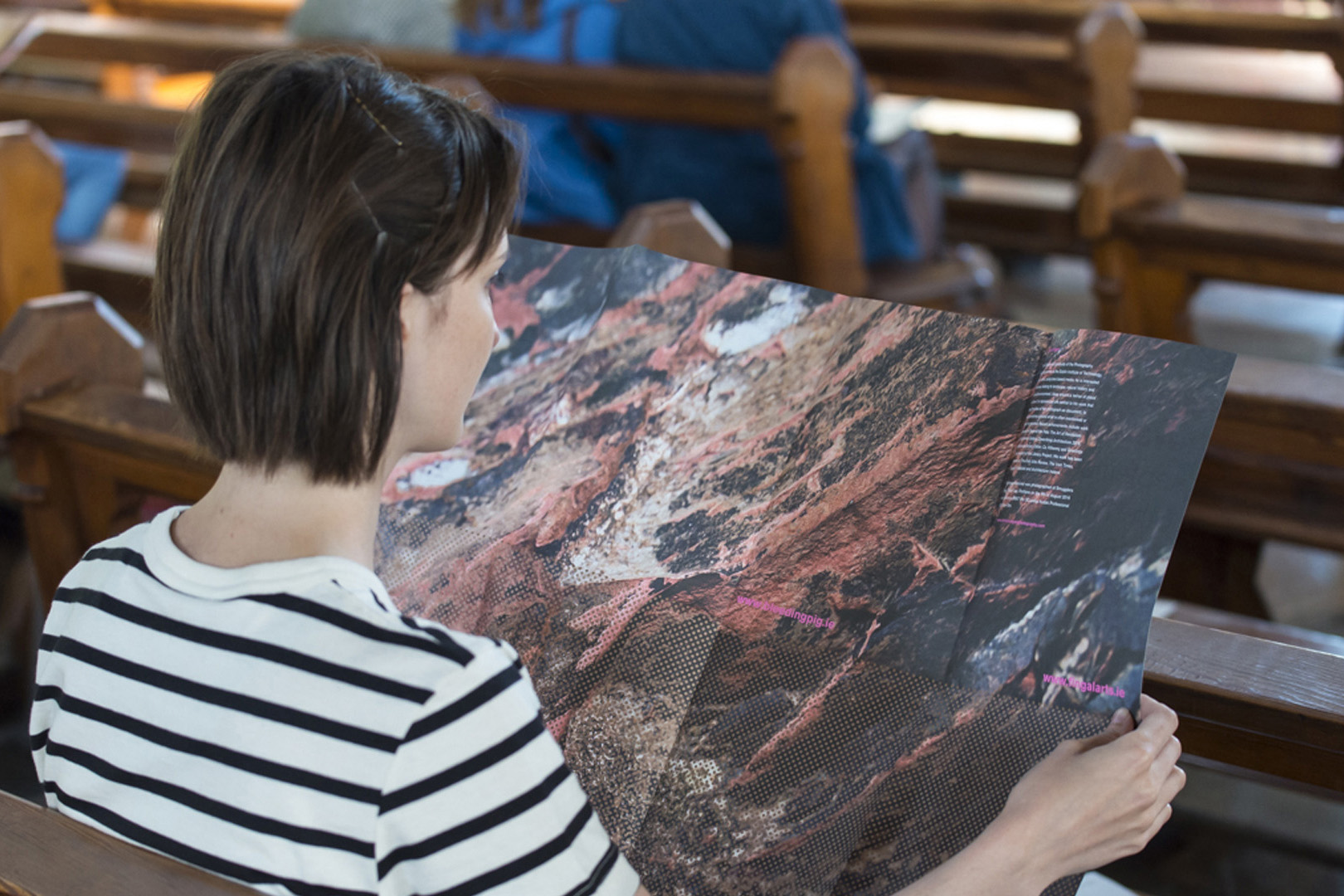
Our design was implemented as a B1 poster that was divided into four visual sections to create a sense of democracy toward the treatment of the content. The sections contained; the program information, Suzanne’s piece, Brian’s photograph and a minimalist graphic overlay of a dotted grid. This patterned grid appears on the side of the mobile home that is used for the residency. As part of the piece’s overall design we printed Brian’s photograph in its entirety using both the poster’s front and back. The full sheet was then cut into two sections that carried all of the posters information on either side. The result was that the image was cut in half providing two finished schedules that had a different section of the image on their reverse.
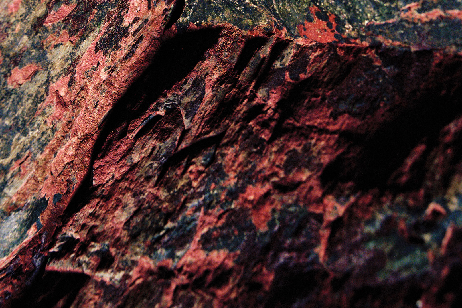
Our work with the photographer involved investigating various locations around Portrane before selecting an infamous local cave. The cave has rock formations that are deep red in color and unique to the area, a result of the volcanic geology of the peninsula. Our intention in selecting the cave was to reflect the sentiments of the residency by looking more closely and deeper at the surrounding area. We set out to achieve a highly detailed and abstract image. Brian shot this image using a Mamiya RB67 Pro SD with Kodak professional 100 Ektar film. The result of which was a photograph of incredible depth and richness of color.
In order to retain the richness of the image’s color, we swopped out the standard process cyan, magenta and yellow inks and replaced them with their fluoro pantone equivalent. Finally we printed the grid over a section of Brian’s image on both the front and back of the poster using a metallic ink which added a layer of depth to the photography which was intended to reinforce the idea of looking deeper to find something that may at first be obscured.Printed 5/5 using 5 spot pantones on 100% recycled 140gsm Cyclus offset