Third Circle is an independent microbrewery that has its beginnings in Kilcoole, Co Wicklow, where Third Circle Director and Brewmaster Jon Grennan grew up. Much like other craft beer enthusiasts, Jon spent several years home brewing all the while developing a passion and love for the art of craft brewing. With his background in freshwater biology, Jon has always taken the scientist’s precision and approach to brewing his beer and mixed this with a healthy disrespect for convention.
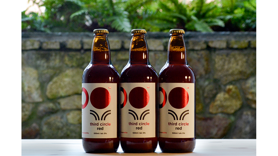
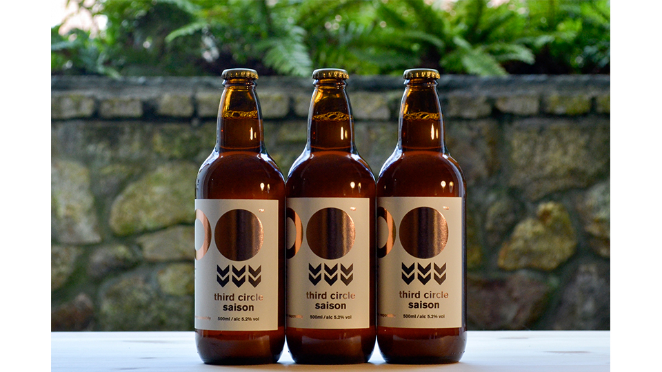
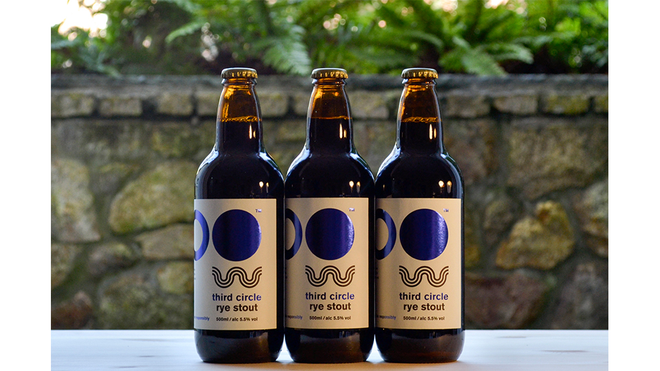
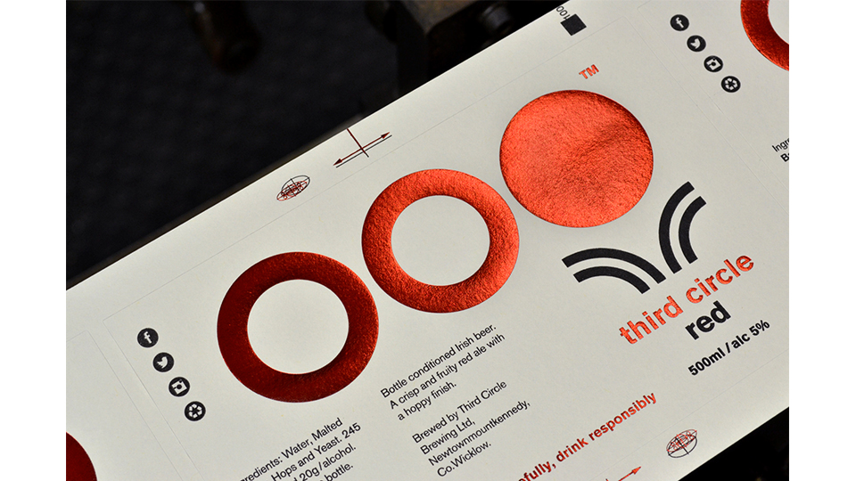
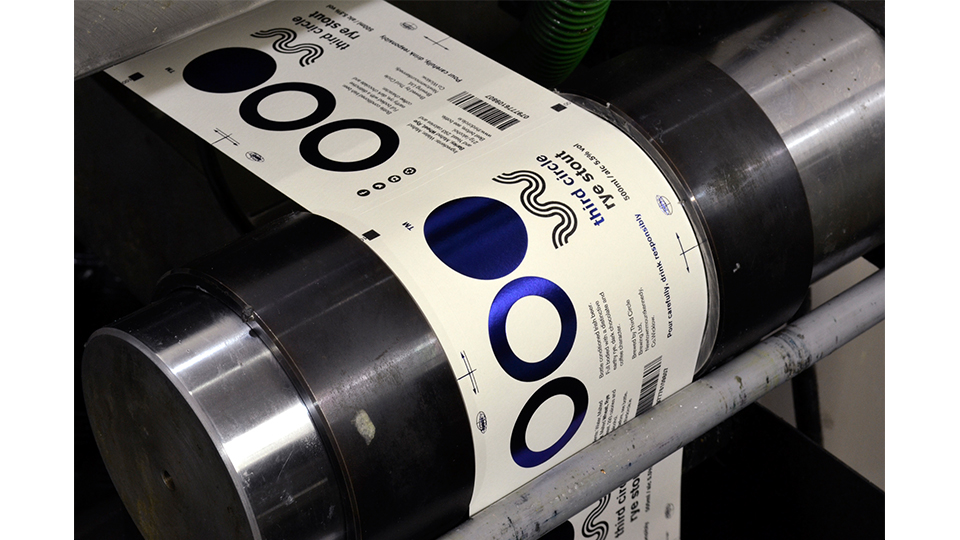
The studio created the Third Circle identity at the beginning of 2015 and has spent the last year seeing it implemented across the brand’s various printed collateral. A primary deliverable and perhaps the most important aspect of the overall project brief was the creation of the Third Circle label. From the outset Third Circle insisted that the brand should have a clean and straightforward approach to its design. Our priority for the brewery was to create a simple yet unique label that clearly identified them within their rapidly expanding market place. Third Circle’s label carries the brand’s logo (foil blocked) as its main visual asset, with the company’s various beers being identified by their own individual icon. Each icon is designed to represent the beer’s primary ingredient in a clean, modernist and somewhat scientific fashion in keeping with our clients own visual tastes.
The label itself is printed using a combination of letter press printing and foil blocking on a Swiss made Gallus press. The label is printed using only one color (black) on an eggshell white uncoated paper stock (Rustic Crème Verge). The stock was specifically chosen to provide a contrast between the metallic foil and the tactile uncoated feel of the paper. As the company creates a new beer we rotate the color of the foil block to best represent the beer in question and develop a new symbol accordingly. This approach keeps the label fresh, allows for individual beers to be easily recognised through both color-coding and iconography whilst being printed in a cost effective and sustainable way, the latter being a fundamental aspect of our original brief.
Craft beer producers operate on extremely small margins of profit in the sale of their product, they also look to produce numerous new beers in any given year. Microbreweries have the ability to produce beer in low volumes. This gives craft brewers a distinct advantage over larger operations in that they can produce a new style of beer in a relatively short period of time. What this means is craft brewers can expand their range of offering on a continual basis. This is a fundamental marketplace advantage that craft brewers have over larger operations (one of the few).
Production quantities on beer can be as low as 600 liters (1200 x 500 ml bottles) resulting in small print runs for the accompanying labels. With this in mind our designs for the labels had to remain consistent and at the same time require minimal design intervention and time so as to make producing these low runs cost effective. New production set-up charges are only required on the black text and icon element of Third Circle’s label which in turn allows them to exploit their capacity to release new beers on an ongoing and financially sustainable basis without affecting the quality of the label design or its production values.
Hard copies submitted in custom designed laser cut sustainably sourced American Beechwood POS display cases, designed by the studio specifically for the project. The cases are used to display Third Circles range on available shelving in off license and bars stocking the product.